Where you lead
What's still yours.
Judgment under ambiguity. The calls AI can't make.
Trust and accountability. Owning the outcome, not just the output.
Reading the room. What the numbers don't say.
Forecast · the signature Move
Not a score. Not a grade. A specific, honest field map, where you lead AI in your field, where it's catching up, and your one next move.
Get your Forecast free →iOS · Free Starter tier · .edu unlocks recruiter visibility
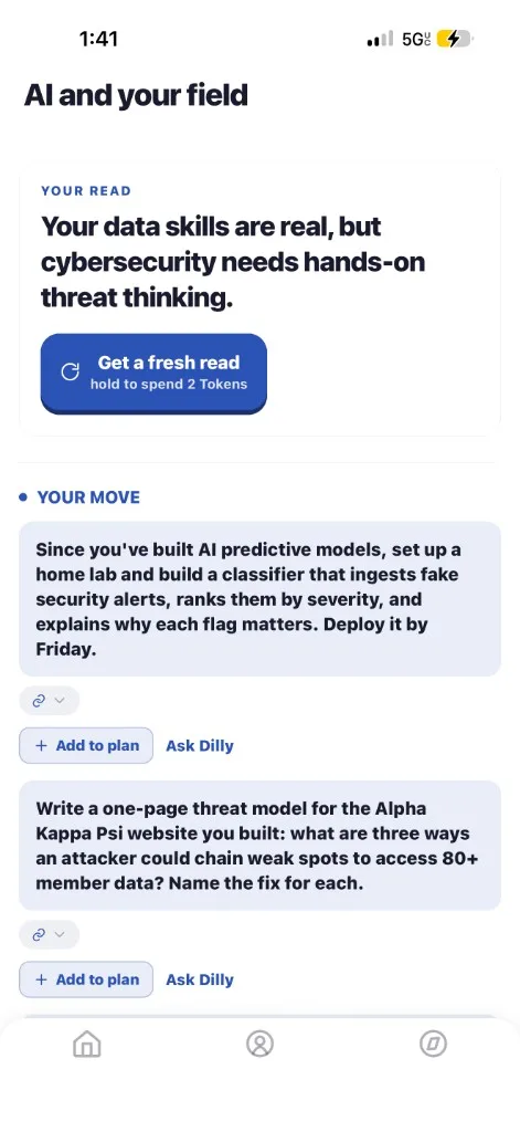
What a Forecast looks like
When you run a Forecast, this is what comes back. Designed like everything else in Dilly: clean, specific, calm.
By field
Different fields, different exposure. Tap a field below to see what a Forecast actually returns for a student in it.
Built from your profile. Read the full guide for Finance →
Why a Forecast, not a grade
A Forecast is the opposite of a grade. It's a map of your field, with you placed inside it, and a clear next step. It tells you something true about where the work is going and what your edge actually is. Calm, not anxious. Concrete, not vague.
It's the read you actually want when you're sitting at a desk at midnight wondering if any of this still matters.
Percentiles compress real situations into a number that hides what you should do. Where you lead, where AI is catching, and what to do next: that is the answer that travels.
Stays current
Your Forecast re-reads itself every month. I'm reading real job postings, real skill demand, real comp data across your field. When the work shifts, your map shifts with it, and you get a fresh "one next move" before the change catches you.
Free Starter tier. iOS, on the App Store. Verify your .edu to unlock recruiter visibility.
Get your Forecast free →iOS only · Android coming soon